ACCESSIBILITY- MY FAVORITE TOPIC!
As someone who is Hard-of-Hearing (HOH), I have thought about accessibility a lot. HOWEVER, I am a human being and I do have a blind spot with this topic (you are welcome for the pun). So looking at how this applies to Digital History is interesting because academics have not gotten too far in this portion of the field, even when researching the topic of disability.
Basically accessibility is in relation to how the webpage looks, acts, and how it works with other accessibility software (i.e. Screenreaders, high contrast, captions, etc.) But this gets tricky because there are more specifics when data is involved. Making sure that the data presented not only makes sense to the audience, but makes sense to the argument being made. I will have a section below with some helpful links from this week that I will be keeping in the future to check myself as well.
Why is this difficult?
This topic is difficult for any human because, most of the time, if we do not need these items we do not tend to think about them. The best example for me personally is Alt Text under photos. I never thought about this necessity until recently and am still learning how to not overshare in them. My favorite example of mistakes in accessibility I struggle with is automatic generated captioning which are also know as #craptions because of how bad they turn out. I think this is one of those topics where society thinks technology is more advanced than it really is!
Examples in Data:
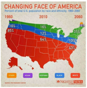
Coming back to the idea of data and how it is represented in for the audience visually and in relation to the argument, there are memes of this misrepresentation in data. I put an example below of how the author should have used a different graph style or completely change how the information should have been represented to better portray their argument. Being from New York State, I can confirm there is not 31% Hispanic in the entire Northeast from PA up. Other examples can be compared in r/dataisugly or r/dataisbeautiful on Reddit.
Also I have begun to understand that certain colors should not be put next to each other. I put a link to an article below called How to Design for Colorblindness and this author gives great advise on how to plan for this with different tools and a list of bad color combinations.
What I have been reminded this week is; when in doubt CHECK YOUR ACCESSIBILITY AND DATA!! It really does not take too long and is easy to see that perspective by using tools already available in most Windows and Mac operating systems.
Later update:
I have found an addition to WordPress called Yoast SEO which can help make your post accessible based on readability, tone, and more. It is based on the Flesch Reading grade. Basically a 60-70 is considered an 8th grade reading level. Anything near 100 is easy to read, and closer to 0 is near college levels of difficulty. This is the format that all future posts will be written in to make sure that my posts are accessible
Helpful Links from this week:
GMU’s example of accessibility training
That’s a good point regarding captioning and how it can be faulty. When I watch some videos on YouTube for example, it there are captions, most of the time they’re pretty spot on. When they suffer from “craptioning” as you put it, they’re at best hilarious and at worst frustrating. It seems like the programming picks up on how everything sounds phonetically and not the actual text. I hope your experiences with bad captions haven’t been too numerous.
You make an amazing point that if something doesn’t apply to us, we don’t really think about the necessity of accessible features. I also agree that auto-generated captions are the worst sometimes. I prefer to watch things with subtitles when I am able to because I have trouble processing what is said sometimes. However, I have pretty much given upon it when an youtube because the captions are sometimes not even remotely related to what wees said. You would think that such a large company would shell out the money for better auto captions.
I can’t believe I had to listen to the blindspot joke in class AS WELL AS read it in this blog post. You made me read that with my own two eyes.
OTHERWISE I enjoyed your post. Your points about the relation in data visualization between the argument being made and the needs of the audience are completely valid. The more complex the website, the more one must be aware of how the site is perceived to a variety of people.
You are right, this is an outrageous graphic. So misleading to have the US map as the background. Also, FYI, I can’t really read it — blurry print — so that’s another thing to be careful about. But why is it the font is so light in this comment box? Did I do something wrong? No, I see it is legible when I move on to filling out my name, etc.
Interesting that even though you are hard of hearing, and presumably have to deal with that/bitch about it all the time, you still have a “blind spot” about accessibility! The module this week certainly made me think about these issues.