Ok so I thought I understood mapping… until this week! Mapping with QGIS was interesting after I was able to get past the learning curve. This curve mostly came from the interface and understanding where to input the right data sets. This actually helped me to understand the data management topic from two weeks ago about Smart vs Clean data and how much of a difference it can make. Without this information, there will be holes in your data and manipulate the information the map shows. This can be significant in both map examples this week with how plagues spread and how elections pan out.
In our readings for the week, there was a heavy discussion on how GIS has transformed and using it in Historical work as the Historical Geographic Information System (HGIS). In an article by Daniele Salvoldi titled A Historical Geographic Information System (HGIS) of Nubia Based on the William J. Bankes Archive (1815-1822), they define the use of HGIS as being “used both for structuring and presenting on a digital map the information extracted from the Bankes’ documents. Once the data are loaded on the HGIS, data interpretation relies comprehensively on ancient written sources and modern archaeological reports, in order to highlight relationships between the different entries in the gazetteer in terms of distance, travel time, climate, ethnicity, polity, environment, water management, and trade resources.” This goes to show how simple or complex a map can become based on the information given.
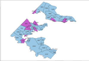
When I completed my elections map of the 2014 Fairfax County, Virginia, I was confused on how to load information in. I had given QGIS too much information to work with which ended up in an overly simplified map. After understanding that mistake, the software became easier to use. I was able to play with what information I wanted shown and how this would bring a different conclusion to light. (Shown below)
Another article we read this week, Beyond the Archives: What GIS Mapping Reveals about German POWs in Soviet Russia by Susan Grunewald, how patterns in a map can lead to other interesting research questions. In this case Susan asks why Soviet railways intersected with German POW camps. The implications of this relationship being connected tells a story in itself about the intricacies of the war. The research she does to explain this is quite interesting! I enjoyed reading about the work she did and the conclusion she reached.
Overall with this week, I was challenged and enjoyed it haha! I lost some of the over confidence I had approaching the topic and learned more out of that. I am still excited to continue in DH work and apply this to museum studies.
Emily,
I admire your efforts to master QGIS. I agree that it seems to be a very useful tool for researchers, and well worth the effort expended on learning how to use it. I just wish that we had more time to go into the more technical aspects of each lesson. Like a few weeks! I think that I could probably use a whole course on how to use GIS to be really good at it.
So what you’re saying…is that….in order to have nice organized data for GIS…I might have…to actually learn…Open Refine…? Villain origin story confirmed.
Ahahaha, but in all seriousness, I am also seeing the connection between data organization and GIS. I guess it really sunk in for me this week how fundamental data organization is to any sort of project, let alone one involving HGIS. This week also reinforced the fragmentary nature of historical documentation. Just looking at my past research and the sources I used on American Indian boundary line treaties, I can’t even catalog how many different names there are for different places depending on the nation, or the interpreter, or what have you. Just debating putting all that data into GIS is giving me a headache.
Hi Emily!
I like your analogy at the beginning that our class modules are like building blocks: we learned about data, how to manipulate data, and now we are learning how to transform data through mapping. It’s a bit like math, when one skill builds on another; however I think we as a class are learning how fundamentally important and mutable data is and how many ways there are to handle it. I admire that you perservered with QGIS because our group overcomplicated the data entry and didn’t get to manipulate the image as much as we could have: when it is successful, you realize that every single part of visualization is in your hands and you can create a story with the data. I hope we will discuss more in the future how much control the historian or researcher has over crafting the context and the images of the work they present.